E-commerce Ad Creative Design Guide: Visual Secrets to Boost Click Rates

In the age of information overload, consumers encounter over 5,000 ad messages daily. How do you capture attention in 3 seconds and spark purchase desire? This guide reveals the core secrets of e-commerce ad creative design—from color psychology to copywriting and testing optimization—helping you boost ad click-through rates by 40%+!
1 Why Is Ad Creative So Important?
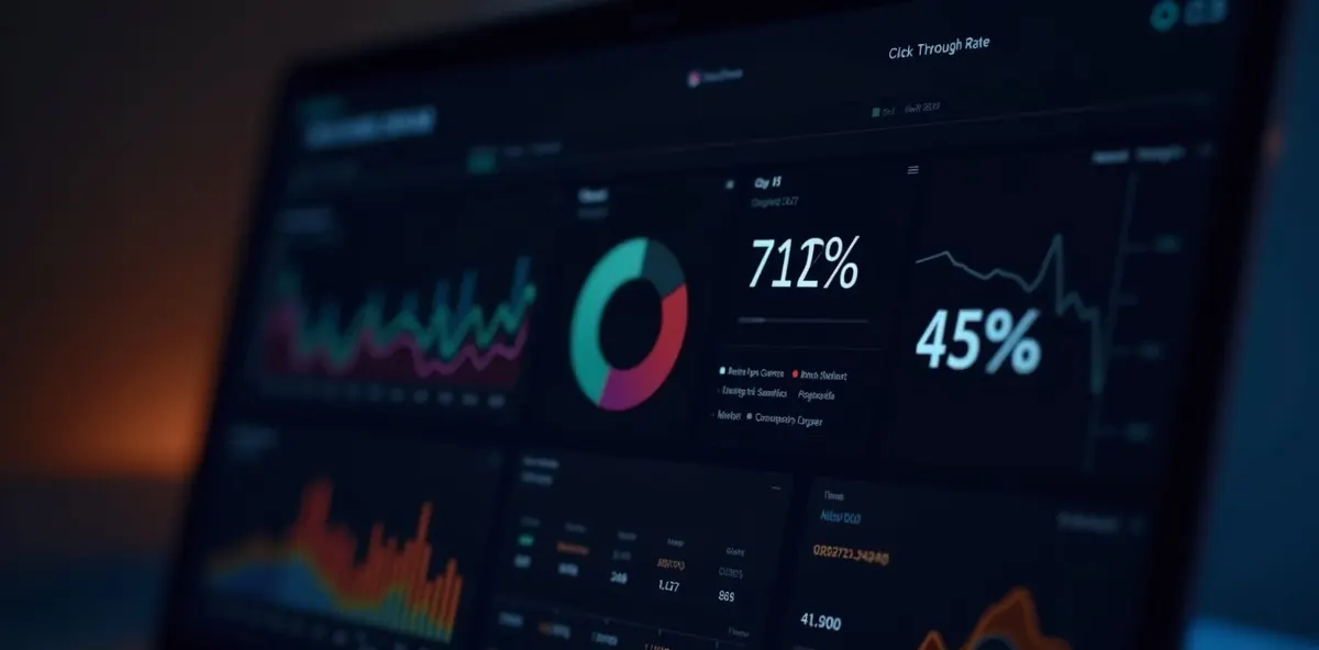
📊 Data Speaks
Ad performance determined by creative
Quality creative can boost ROI 3-5x with same budget
Golden window to capture attention
Miss the first 3 seconds, nothing else matters
Average CTR increase after optimization
Systematic optimization from color to copy
Recommended creative variations to test
Find winning combinations through A/B testing
💡 Core Concepts
- ✓ Visual First: Brain processes images 60,000x faster than text
- ✓ Emotional Connection: Ads that trigger emotions convert 2-3x better
- ✓ Continuous Optimization: Creative fatigue sets in after 7-14 days, refresh regularly
- ✓ Platform Adaptation: Different platforms need customized designs
2 5 Golden Rules of Visual Design
Rule 1: Color Psychology
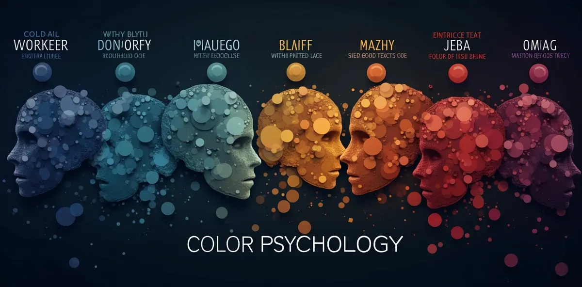
Red - Urgency
Best for: Limited offers, promotions, clearance sales
Boosts CTR by 15-20%
Orange - Energy
Best for: Youth brands, sports, food & beverage
Increases engagement by 12-18%
Green - Health
Best for: Organic products, eco brands, health foods
Increases trust by 25%
Blue - Trust
Best for: Tech products, financial services, corporate
Enhances professionalism by 30%
Purple - Luxury
Best for: Premium goods, beauty, high-end services
Increases perceived value by 35%
Yellow - Optimism
Best for: Kids products, entertainment, creative brands
Boosts attention by 20%
⚡ Color Strategy Tips
- • 60-30-10 Rule: 60% primary, 30% secondary, 10% accent color
- • Contrast: Text-background contrast ratio minimum 4.5:1 for readability
- • Brand Consistency: Use brand colors to strengthen recognition
- • Avoid Overload: Maximum 3-4 colors to prevent visual chaos
Rule 2: Visual Hierarchy & Composition

F-Pattern Layout
Best for text-heavy ads
- • Headline top-left
- • Key info horizontal
- • CTA button left side
Z-Pattern Layout
Best for image-focused ads
- • Logo top-left, CTA bottom-right
- • Visual flow in Z-shape
- • Natural reading progression
Center Layout
Best for single product showcase
- • Product centered
- • Whitespace around subject
- • Clean, powerful impact
📐 Golden Ratio Principles
Rule of Thirds
Divide into 9 sections, place key elements at intersections
Golden Ratio
1:1.618 ratio creates visual balance and beauty
Whitespace
Reserve 20-30% whitespace to avoid clutter
Visual Weight
Size, color, position determine element importance
Rule 3: Product Display Techniques
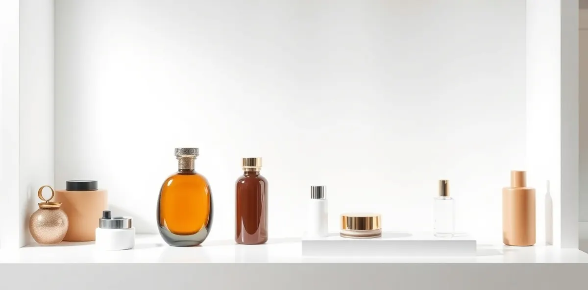
🎯 5 High-Converting Display Methods
Lifestyle Context
Help customers imagine using the product
Conversion boost: +35%
Before/After
Show transformation and product effectiveness
Conversion boost: +42%
Detail Close-ups
Highlight quality and craftsmanship, build trust
Conversion boost: +28%
Multiple Angles
360° comprehensive view reduces purchase hesitation
Conversion boost: +25%
Real People Using
Increase authenticity and relatability, boost trust
Conversion boost: +38%
💡 Professional Photography Tips
- • Lighting: Use soft natural light or professional lightbox, avoid harsh shadows
- • Background: Solid color highlights product, lifestyle adds story
- • Angle: 45° most natural, overhead for flat products
- • Size: Product occupies 60-80% of frame with appropriate whitespace
Rule 4: Typography & Layout

📝 Text Hierarchy
Main Headline
24-36px, bold, most eye-catching
Subheadline
18-24px, semi-bold, supporting info
Body Text
14-16px, regular, detailed info
Supporting Text
12-14px, light, secondary info
🎨 Font Selection Principles
Sans-serif Fonts
Modern, clean, ideal for tech and fashion brands
e.g., Arial, Helvetica, Noto Sans
Serif Fonts
Classic, professional, ideal for traditional and premium brands
e.g., Times New Roman, Georgia
Script Fonts
Personal, warm, ideal for creative and handmade brands
Use sparingly to maintain readability
⚡ Typography Golden Rules
- ✓ Line Height: 1.5-1.8x font size for readability
- ✓ Letter Spacing: Adjust appropriately, avoid too tight or loose
- ✓ Alignment: Left-align most readable, center for short text
- ✓ Word Count: Headlines 6-10 words, body max 50 words
- ✓ Contrast: High text-background contrast required
- ✓ Consistency: Use same fonts across all ad series
Rule 5: Dynamic Elements
🎬 Why Use Dynamic Ads?
CTR Increase
Engagement Boost
Recall Improvement
📱 5 High-Impact Dynamic Effects
Product Rotation
360° spin showing all angles
Text Animation
Word-by-word reveal, slide-in effects for visual appeal
Usage Demo
Short video showing how to use product, improves understanding
Countdown Timer
Limited-time offer countdown creates urgency
Carousel
Auto-switching images showcase more information
⚠️ Dynamic Ad Best Practices
- • First 3 Seconds Critical: Show core value immediately to capture attention
- • Control Duration: 6-15 seconds optimal, avoid too long causing drop-off
- • Sound-Off Friendly: Add captions so message works without audio
- • File Size: Keep under 5MB for fast loading
- • Loop Seamlessly: Design beginning and end to connect naturally
3 AIDA Copywriting Framework

Attention - Grab Attention
First 3 seconds determine success! Use strong visuals or shocking data to capture eyes.
✓ Good Openers
- • "3 Days Only! 50% Off Everything"
- • "90% Don't Know This Secret"
- • "Save $5,000 Monthly With This"
- • "Free 30-Day Trial"
✗ Avoid These Openers
- • "We are a company..."
- • "Welcome to..."
- • "Product introduction..."
- • Too bland and generic
Interest - Generate Interest
Explain how product solves user pain points, build emotional connection.
💡 4 Interest-Building Techniques
Desire - Create Desire
Help users imagine the better life after owning product, build craving.
🎯 Desire-Building Methods
- • Visualization: Show results after use
- • Social Proof: User reviews and recommendations
- • Scarcity: "Only 50 units left"
- • Bonus Offers: "Buy now and get XXX free"
📝 Copy Examples
"Imagine waking up every morning with radiant, hydrated skin, confidently starting your day..."
"Over 5,000 moms recommend this secret to baby sleeping through the night..."
Action - Call to Action
Clearly tell users what to do next, lower decision barriers.
🚀 High-Converting CTA Design
Shop Now
Direct, clear
Try Free
Lower barrier
Limited Time
Create urgency
✓ Use Action Verbs: "Now", "Immediately", "Today"
✓ Button Color: Use contrasting color for visibility
✓ Position: Place at visual focal point, easy to click
✓ Size: Button large enough, minimum 44x44px on mobile
4 Social Proof & Trust Building

🏆 6 Types of Social Proof
Customer Reviews
Real user experiences and ratings
Sales Data
"100,000 sold", "Monthly bestseller"
Expert Endorsements
Doctors, nutritionists, professional backing
Media Coverage
Famous media interviews or features
Certifications
ISO, SGS, official certifications
User Count
"Over 500,000 users"
🛡️ Trust Badge Design
Security Guarantee
SSL encryption, secure payment, privacy protection
Return Policy
7-day trial, 30-day returns
Customer Support
24/7 support, instant response
Quality Assurance
Manufacturer warranty, quality inspection
💡 Social Proof Usage Tips
- ✓ Authenticity: Use real data and reviews, avoid faking
- ✓ Be Specific: "4.8-star rating" more convincing than "rave reviews"
- ✓ Visualize: Use stars, badges to enhance visual impact
- ✓ Position: Place near product images to increase credibility
- ✓ Update: Regularly refresh data to maintain freshness
- ✓ Diversify: Combine multiple proof types for stronger persuasion
5 A/B Testing & Continuous Optimization
🧪 What Is A/B Testing?
A/B testing runs two or more creative versions simultaneously to compare performance. Through data-driven decisions, continuously optimize ad effectiveness.
Average CTR Increase
Average CPA Decrease
ROI Improvement
📊 8 Key A/B Testing Elements
Headline
Test different copy and lengths
Main Visual
Product vs lifestyle vs people images
Color Scheme
Test different color combinations
CTA Button
Copy, color, position, size
Price Display
Original price comparison, discount format
Social Proof
Reviews, sales numbers, recommendations
Offer Message
Limited time, limited quantity, bonuses
Layout
Element arrangement and visual flow
🎯 A/B Testing Execution Steps
Set Testing Goal
Clearly define metrics to optimize (CTR, conversion rate, CPA, etc.)
Choose Test Variable
Test only one variable at a time for accurate results
Create Test Versions
Make 2-5 different creative variations
Allocate Traffic
Evenly distribute ad budget across versions
Collect Data
Run for at least 7-14 days to ensure sufficient data
Analyze Results
Compare version performance, identify winner
Apply Optimization
Roll out winning version to all ads
Continue Testing
Keep testing other elements for ongoing optimization
⚠️ A/B Testing Best Practices
- • Sample Size: Each version needs minimum 1,000 impressions for validity
- • Statistical Significance: Ensure results reach 95% confidence level
- • Test Duration: Avoid mixing weekends and weekdays for data consistency
- • Single Variable: Change only one element to identify impact factor
- • Document Results: Build testing database to accumulate optimization experience
6 Illustrative Example: How Creative Optimization Can Lift CTR
(Illustrative scenario — figures are for explanation only, not actual client data)
📈 Scenario Background
Industry
Beauty & Skincare E-commerce
Product
Anti-aging Serum
Target Audience
Women 25-45 years old
Ad Platform
Facebook & Instagram
Test Period
30 days
Ad Budget
$3,000 daily
❌ Original Version Issues
Visual Problems
- ✗ Product image too small, not prominent
- ✗ Cluttered background distracts attention
- ✗ Bland colors, lacks visual impact
- ✗ Too much text, heavy reading burden
Copy Problems
- ✗ Headline too bland, lacks appeal
- ✗ No clear pain point description
- ✗ Missing social proof and data support
- ✗ CTA not clear enough
Original Metrics
0.85%
Click-through Rate
$45
CPA
2.1
ROAS
✅ Post-Optimization Improvements
Visual Optimization
- ✓ Product enlarged to 70% of frame, highlighting subject
- ✓ Used solid color background, increased contrast
- ✓ Adopted gold color scheme, enhanced premium feel
- ✓ Simplified text, kept only core message
Copy Optimization
- ✓ Headline changed to: "Fade Fine Lines in 7 Days, Return to Age 25 Skin"
- ✓ Added pain points: "Say goodbye to dullness, sagging, fine lines"
- ✓ Added social proof: "8,000+ five-star reviews"
- ✓ CTA changed to: "Limited 50% Off, Shop Now"
Optimized Metrics
1.34%
CTR ↑58%
$28
CPA ↓38%
3.8
ROAS ↑81%
💡 Key Success Factors
Visual Simplification
Remove clutter, make product the absolute hero
Pain Point Resonance
Precisely describe target audience's skin concerns
Data Support
Use specific numbers to enhance credibility and persuasion
Urgency
Limited-time offer prompts immediate action
Continuous Testing
Find optimal combination through A/B testing
🎯 Ad Creative Design Key Takeaways
First 3 Seconds Decide Everything
Use strong visuals or shocking data to capture attention immediately
Visual Over Text
Brain processes images 60,000x faster than text
AIDA Framework Essential
Attention→Interest→Desire→Action, interconnected
Social Proof Builds Trust
Reviews, data, certifications enhance credibility
Continuous A/B Testing
Data-driven decisions, constant optimization
Color Psychology
Different colors trigger different emotional responses
Dynamic Effects Boost Performance
Average 47% CTR increase
Regular Creative Refresh
Avoid creative fatigue, maintain freshness
💪 Take Action Now
Excellent ad creatives aren't built overnight—they require continuous testing and optimization. Start today by applying these design principles and finding the best creative combinations for your brand through A/B testing. Remember: data doesn't lie, let data guide your optimization direction!
You May Also Like
Curated based on your reading interest
2026 Short Video Ad Creative SOP: The Complete Workflow from Script to Launch
Instagram Algorithm Now Penalizes TikTok Reposts: How to Remake Your Ad Creatives Without Getting Suppressed